Let's talk about user interfaces in adventure games
“Something that really fascinates me is: You have text-based games; then you have graphical adventure games where you have to command with text; then you have games like Maniac Mansion, where you have a point-and-click syntax world, where you don't have to type in whole things, but you still have syntax; and then the syntax falls away, and things are pairing down and pairing down, until you have five graphical cursors, and then one cursor. Wow.”
- Jenn Frank (Retronauts Podcast, Episode 27)
***

Some people have wondered how the classic 9-verb-UI came to be our interface of choice. Is it a bit of nostalgia? Sure. Is it because we want to continue and pay hommage to a certain school of adventure game design? Also true. But first and foremost, we really, really like the 9-verb-interface, and I'm going to try to explain why.
Consider the quote above by Jenn Frank, which is a quick and of course highly simplified rundown of the history of adventure game user interfaces.
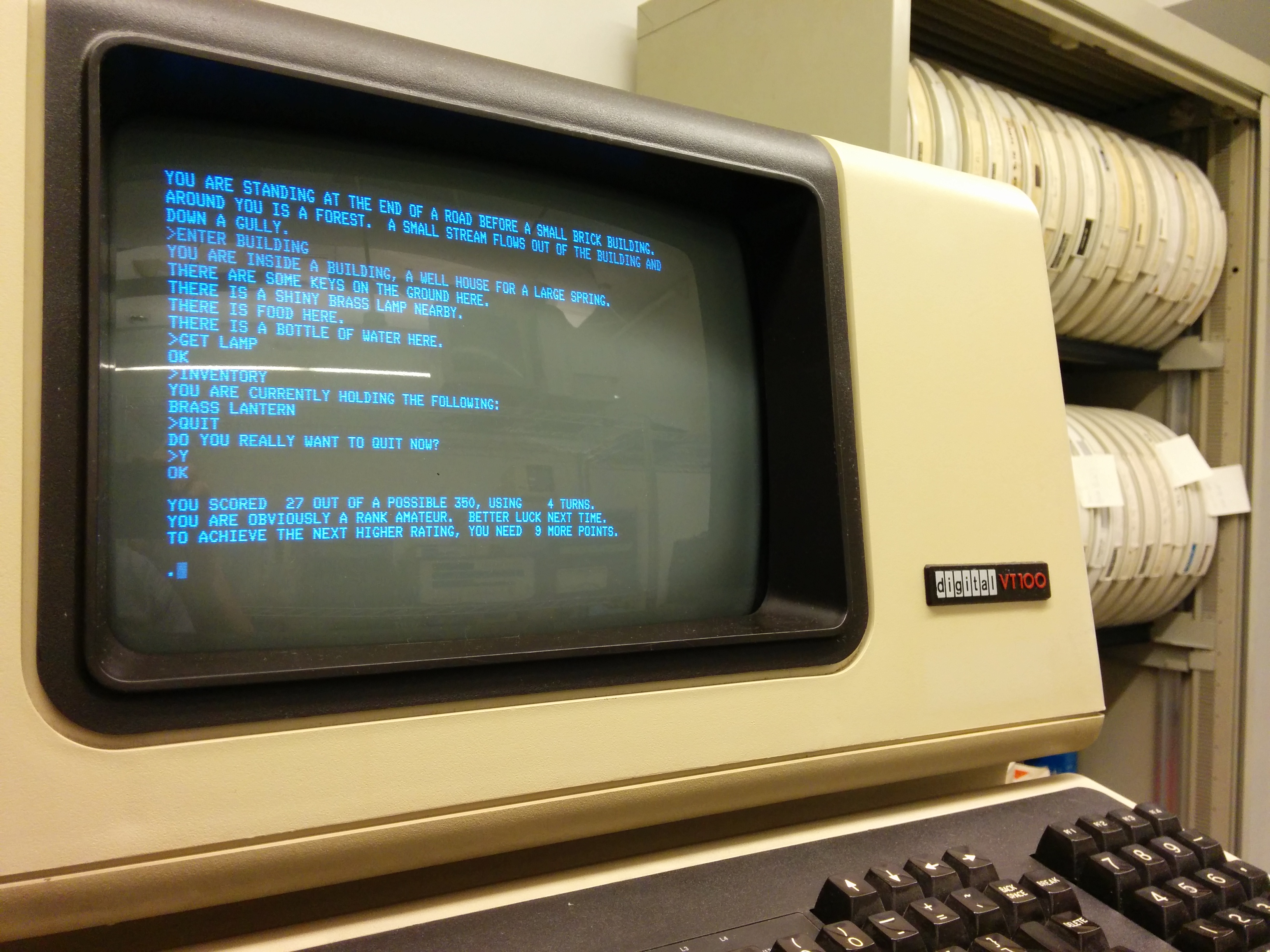
The formative granddaddy and name-giver of the adventure game, William Crowther's Adventure from 1976, was completely text-based, and you interacted with the game world exactly like you usually would with a computer at the time: by typing simple commands into a text-based terminal, in that case stuff like "GO NORTH" and "GET LAMP".

During the 80s, text adventure games from developers like Infocom and Magnetic Scrolls were able to understand more and more sophisticated inputs like articles, pronouns, indirect objects (“put a battery into the flashlight”), numbers (“give three coins to the beggar”) or multi-word nouns (“examine the thing your aunt gave you which you don’t know what it is”). In the best of them you could in theory type things like “hit the ugly man with the blackjack, then take all from his purse except one shilling”.
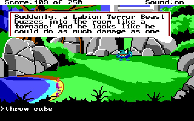
Text parsers have a bad rep, mainly because people remember them from Sierra’s graphic adventure games (like King's Quest, Space Quest or Leisure Suit Larry) that used most of their memory space for displaying a graphical three-dimensional world you could let an avatar walk around in - which was an awesome innovation, but didn’t leave much space for a complex parser, even though text input still was the primary means of interacting with the world. So as a result, you would often type something, only for the game to respond "I DON'T UNDERSTAND", because you didn't phrase it exactly the right way.

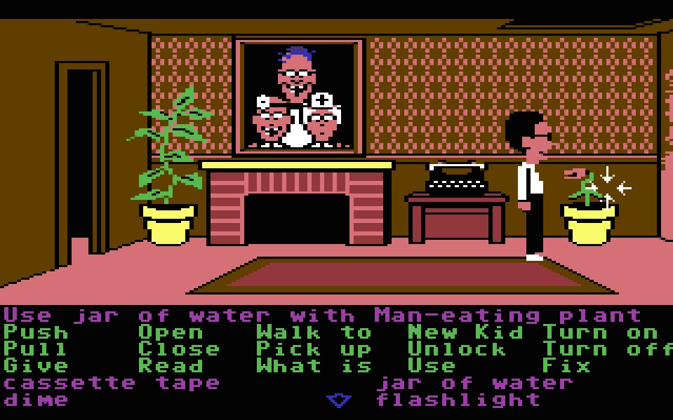
Then Maniac Mansion by LucasArts (Lucasfilm Games at the time) famously came along, and did away with all possible syntax-based frustrations, in two ways: first by replacing text input by a cursor driven interface, and second by displaying all possible verbs on the screen at all times. The mysterious power of the invisible parser as a tempting suggestion of an infinite possibility space, this big black box of the adventure game, it was gone, all cards on the table. The possibility space was literally depicted on the screen at all times.

A lot of oldschoolers didn’t like that, of course, and it got especially bad when in later games LucasArts reduced the numbers of verbs in their interface to one with only nine verbs - one of them the swiss army knife of verbs: “Use”. It makes it too easy, they argued, to just brute-force your way through different combinations of items and verbs instead of doing some actual creative thinking.
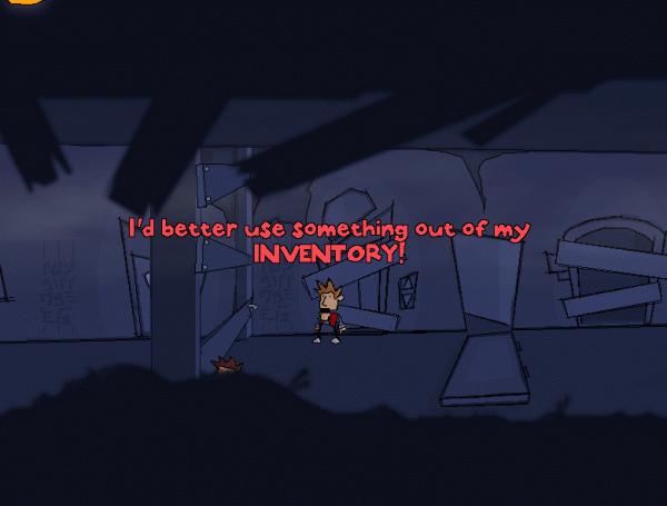
Mind that at this point, the heart and soul of the adventure game was still the text command, only instead of typing it, you constructed your sentence (displayed in the command line in the middle of the screen) by pointing and clicking. As time went on, the verbs turned into graphical cursors, reducing the number of possible interactions even further, until even those gave way to the standard of a single cursor, in which left-clicking on something meant "interact", and right-clicking meant "look". Much more convenient of course, with the trade-off being a considerably less interactive game world.
When looking at this whole decade-long historical development, the 9-verb-interface struck us as the perfect middle-ground between possibility space and convenience - easy to grasp, but not too limiting. There is almost always a quick and "obvious" way of interacting with most things (TALKING to Nurse Edna), but to make progress, you need to experiment with different verbs, and how they work with certain objects and people in unusual, often funny and unexpected ways (PUSHING Nurse Edna down the stairs).

The thing is: One unique aspect of adventure games, especially considering today's gaming landscape, is that you can spend big amounts of time without making progress. Even if you're just fooling around in a sandbox game, most of the time there are still at least "numbers going up" and there is some kind of loop going on. When you're stuck in an adventure game, you can look for clues, but the only real progress towards finding a solution is happening in your head. Which means "solving puzzles" is actually not the main gamplay element of an adventure game. Most of the time you won't actually spend solving puzzles, but clicking on stuff, looking for clues, trying different things, exploring and experimenting. The best adventure games understand that, and try to make the "exploring and experimenting" part as fun and rich and rewarding as possible.
That's what we are trying to do - give you lots of ways to explore, hang out and fool around, even if you are not strictly "progressing the story" (while we try to gently nudge you in the right direction). Also, we just kind of love words - dialogs, puns, wordplay, and playing around with language in general. And therefore we also love the mechanic of constructing sentences as a way of interacting; it strikes us as the perfect way for a player to slip into the character of Maria and experience the weird wonderful world of The Funny Boneyard.
Cheers!
- Andi
Get The Funny Boneyard (Demo)
The Funny Boneyard (Demo)
A Hangout Adventure Game
More posts
- We were at Vienna COMIXJun 01, 2024
- YES, we're OPEN!Dec 31, 2023
- A life sign? That's an understatement, we got several!Jul 20, 2022
- Getting the look rightAug 18, 2020
- How to make a wacky backgroundJun 08, 2020
- Characteristics & #STAYHOME (it's good for development)Mar 22, 2020
- Animating Father CassidyMar 16, 2020

Comments
Log in with itch.io to leave a comment.
Could it be, that you meant Colossal Cave Adventure and got it mixed up with the Atari 2600 classic Adventure by Warren Robinett?
Anyway, looking forward to finally get my hands on those nine verbs of glory :)
Hi! Colossal Cave Adventure has quite a number of different names, and was actually also known as Adventure (or sometimes just ADVENT, after its filename). I usually stick to the Adventure name, not just because of its genre-naming quality but also because of the classic original title screen ("WELCOME TO ADVENTURE!!"). In fact, Robinett created his Adventure as an adaptation of (the 1977 Don Woods version of) the text game, basically establishing the template for translating the narrative experience of a keyboard-controlled, text-based computer game to the joystick-driven interface and visual language of a console game.
Thanks for the clarification! I thought Robinetts Adventure was only inspired by Crowthers Adventure. I did not know that he actually made his game an adaption. It's just great when developers clearly are invested in the history of the genre they're developing for. Keep it up!