Getting the look right
You may have noticed that The Funny Boneyard goes for a very specific kind of style, trying to evoke the early 90s, when graphic adventure games had their Golden Age and cartoon animation was experiencing a renaissance.
Of course, using a low-res pixel art style is hardly uncommon today, but there are a lot of different approaches. Josef already talked about his artistic style and influences; let me in turn share some of the more technical details.
As someone who fancies himself a bit of a hobbyist video game historian, I spend a lot of time reading, watching videos, and fiddling around with different tools and emulators to get as close as possible to an authentic look for older games when I play them, but I spend even more time trying to find the definitive answer to what "authentic" actually means. And I'm still learning.


Fortunately, over the last couple of years, a lot more people became interested in this question, so there is no shortage of resources and explanations out there. And, most importantly, we have the necessary technology now. Emulators and CRT filters have become so good that I'm considering to finally throw out my old big-ass CRT TV and collection of retro consoles and games (because, as you can imagine, these things take up a lot of space).
Take aspect ratios, for example. The quest for the "correct" aspect ratio drove me crazy for years. Sure, you could say, "Well, monitors and TVs were 4:3 at the time, so there's your answer", but it's not that easy. Many games, especially on home computers, didn't use the whole screen space, leaving black borders - or not, because on most monitors, the end user could seamlessly adjust the width and height of the image to his or her own liking.
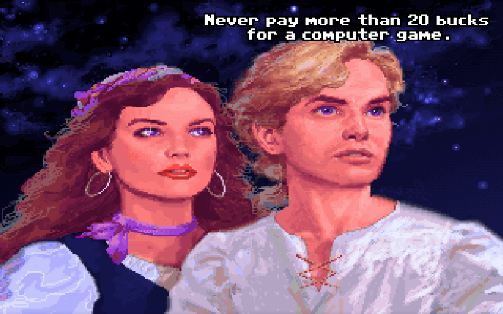
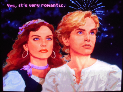
You could say, "Make sure that the pixels are perfectly square, and you get the intented aspect ratio", except that that's not how it works, because on a CRT TV pixels are not squares, but radiating points that blend into each other, which also gives the image a softer look. 90 percent of screenshots of old games online are displayed in a raw 1:1 pixel aspect ratio, which not only undercuts the softening and blending effects of a CRT monitor (which luckily can be restored by image filters pretty well by now), but also unnaturally stretches the image, and in turn distorts our memories, so that most of us are convinced games really looked like that back then.
You could say, "Just look at an in-game circle then. If it's perfectly round, you at least have the right resolution", but that's were the problems really start: Using that method I now started to see images in the same game that looked as they were made for different aspect ratios (Castlevania: Symphony of the Night with its elliptical-shaped moon on the title screen nearly drove me insane). Sometimes I would even notice discrepancies in the very same image!
Somewhere down the line, the truth started to dawn on me: Developers, even the absolute pros, didn't really give a fuck most of the time. There is no single "correct" aspect ratio, even for games made for the same console or using the same tools. For example, the graphics for SNES games were drawn on a computer screen in 8:7, but displayed on a TV in 4:3 - some devs accounted for that, others don't. And when a game was brought over from Japan or the US to Europe, the aspect ratio changed again due to the switch from NTSC to PAL format.
Anyway, what does all this mean for The Funny Boneyard?
Well, the lesson learned is that we try not to obsess over "the correct look" too much. We would surely do a few things differently if we started the game over from scratch today, but seeing as the project kind of evolved organically from us experimenting, rather than being planned out from the very start, we try not to make it harder on ourselves than necessary, which is why our game is somewhat "in-between".
Our resolution of choice is 320x200, which is the same most Golden Age adventure game devs used. On modern monitors, that results in a 16:10 aspect ratio and a slightly streched image, which Josef accounts for when drawing his art. The raw, chunky, unfiltered pixel look is intended as well, but if you prefer the look of CRT scanlines to get the full authentic retro experience, you can use a tool like ReShade to add different kinds of filters and effects to the image.
We apply this "enhanced retro" approach to the color palette as well: Our base is the classic Deluxe Paint palette, used by many game devs back in the day - but when we really need one more different shade of brown, we use it. Same with music, by the way. We use a MIDI soundfont to emulate the classic Adlib sound as closely as possible, but we don't, for example, artifically limit the number of channels. But pssst - don't tell anybody I said that.
- Andi
Get The Funny Boneyard (Demo)
The Funny Boneyard (Demo)
A Hangout Adventure Game
More posts
- We were at Vienna COMIXJun 01, 2024
- YES, we're OPEN!Dec 31, 2023
- A life sign? That's an understatement, we got several!Jul 20, 2022
- How to make a wacky backgroundJun 08, 2020
- Let's talk about user interfaces in adventure gamesApr 29, 2020
- Characteristics & #STAYHOME (it's good for development)Mar 22, 2020
- Animating Father CassidyMar 16, 2020

Leave a comment
Log in with itch.io to leave a comment.